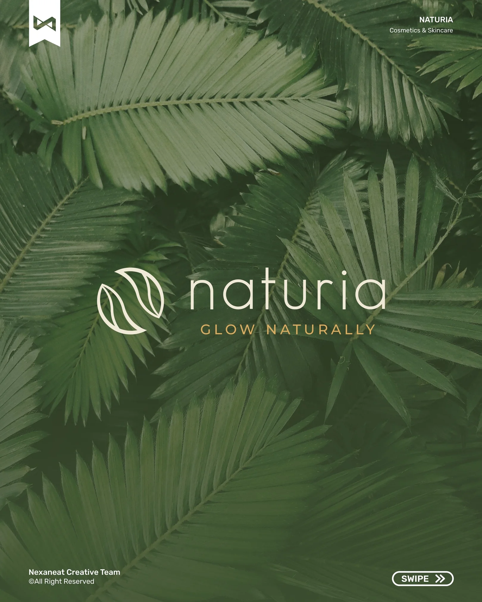
A tropical skincare line wanted to look like it was grown, not formulated. We built an identity with the quiet of a glasshouse and the warmth of afternoon sun — a mark that fuses a leaf, a letter, and a closed circle into one glyph.
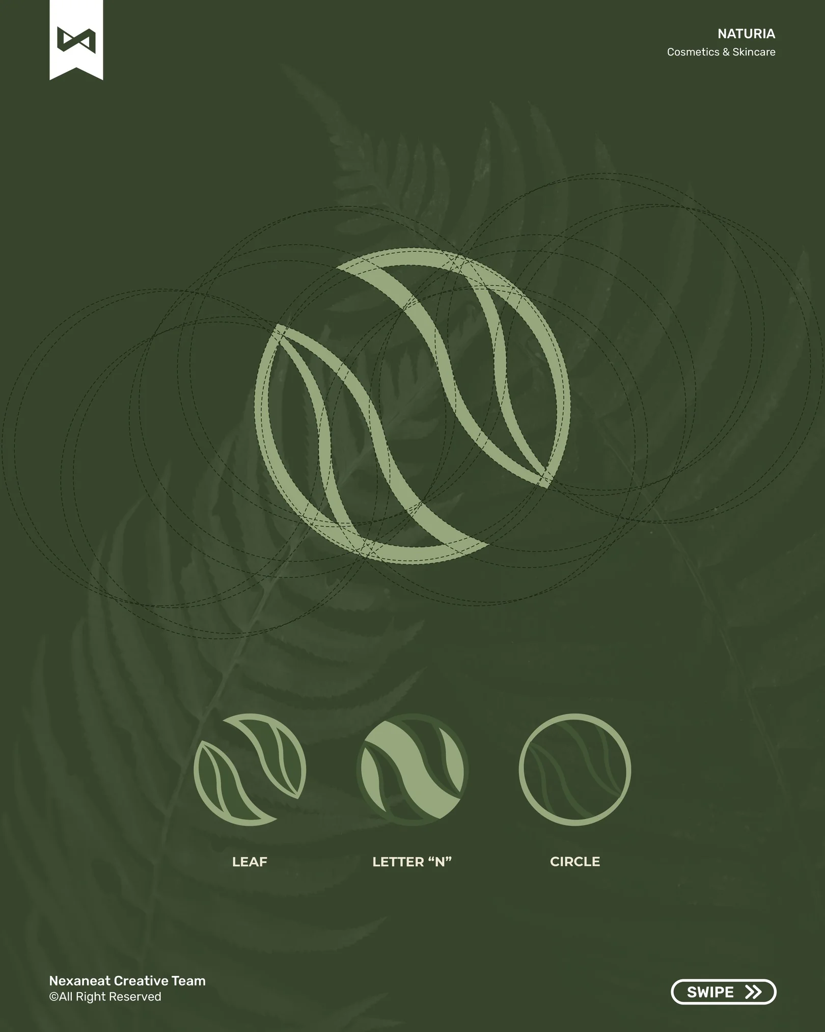
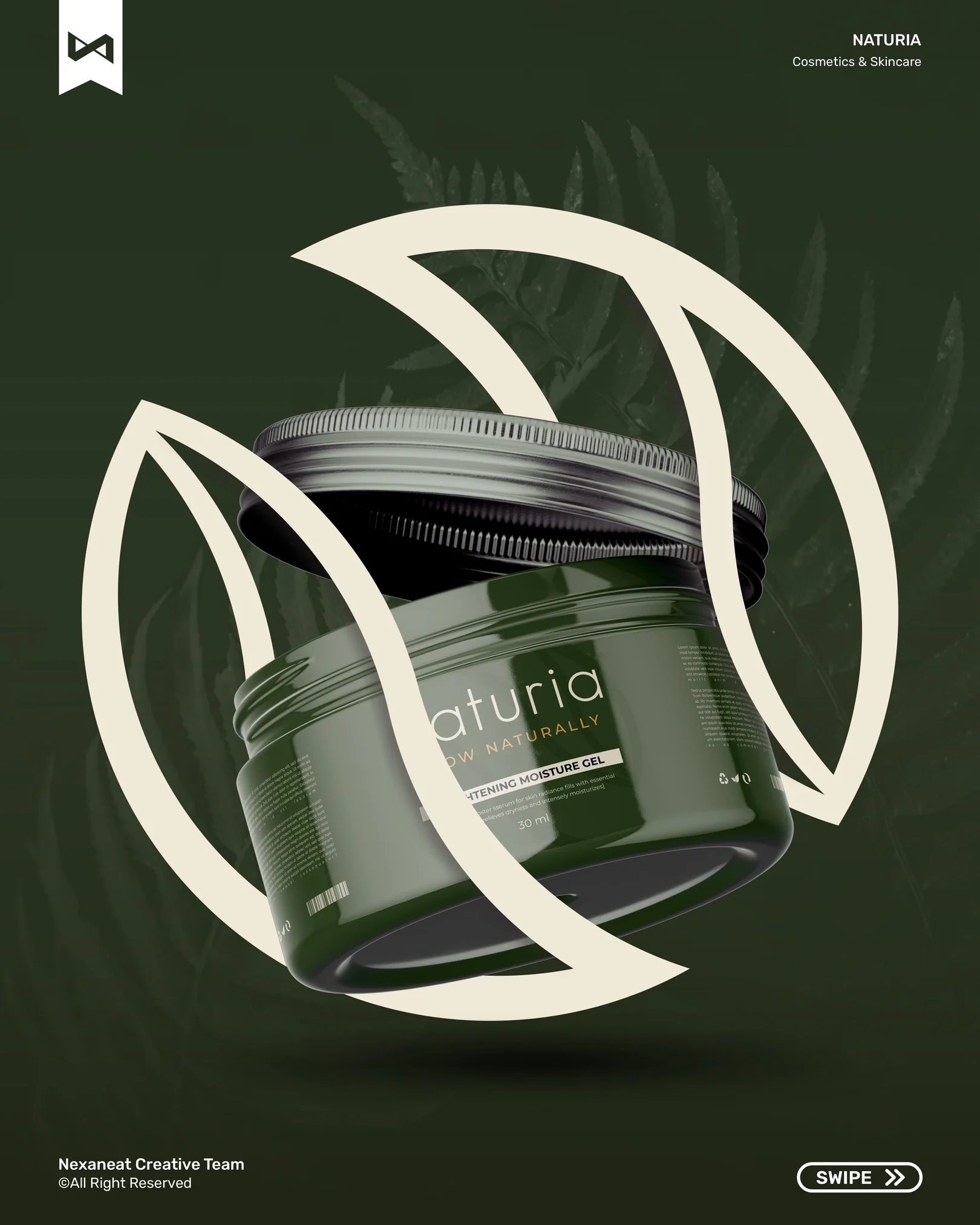
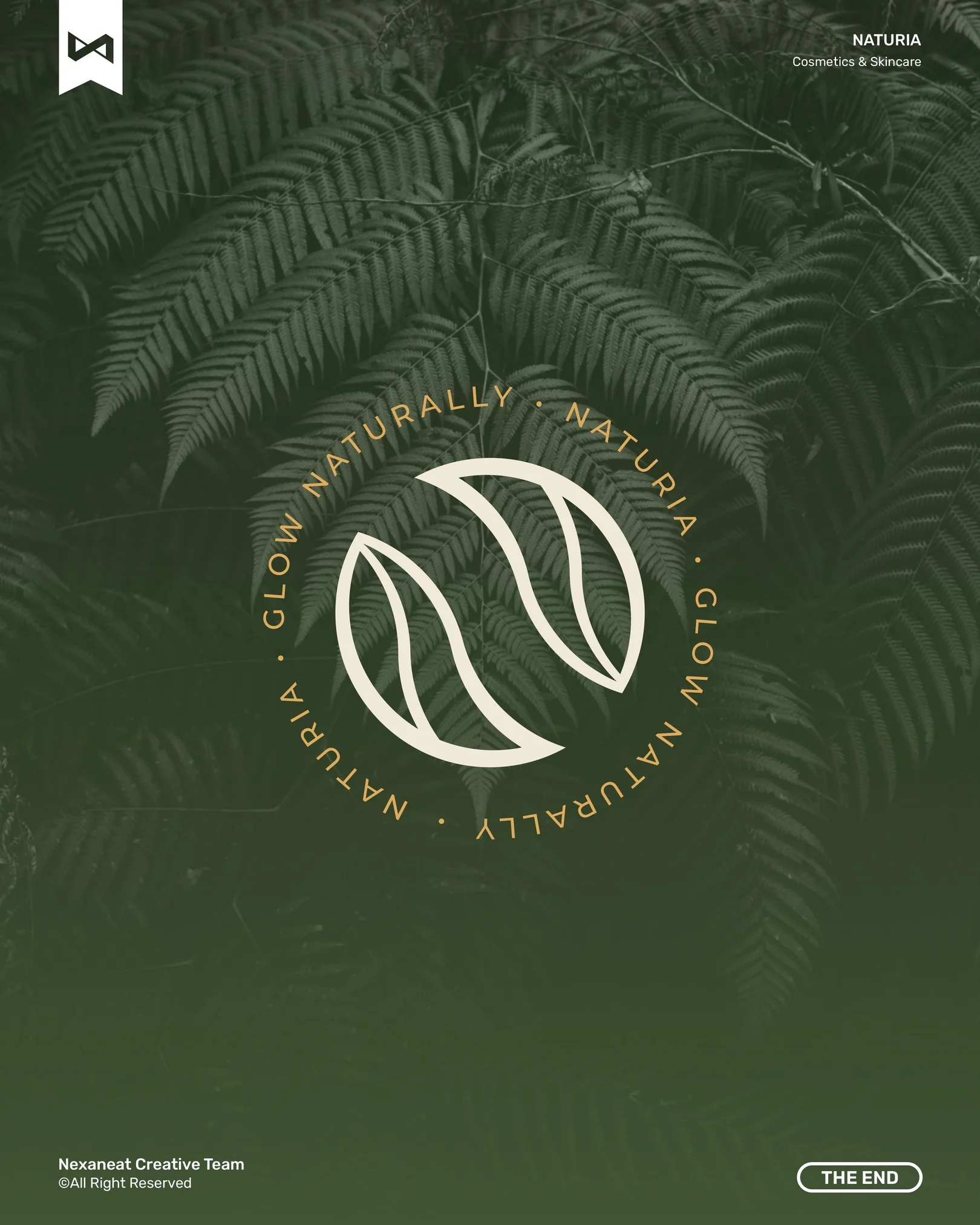
We compressed three signifiers into a single shape: a leaf (botanical origin), the letter N (the brand's initial, hidden in the negative space), and a circle (a closed loop — skin, planet, supply chain). Gestalt closure does the work: the eye completes the circle from two curved leaf-halves, so the logo reads as intention rather than decoration. Stroke weight is even, terminals are rounded — a biomorphic contour that sits comfortably next to skin and soft linen alike.
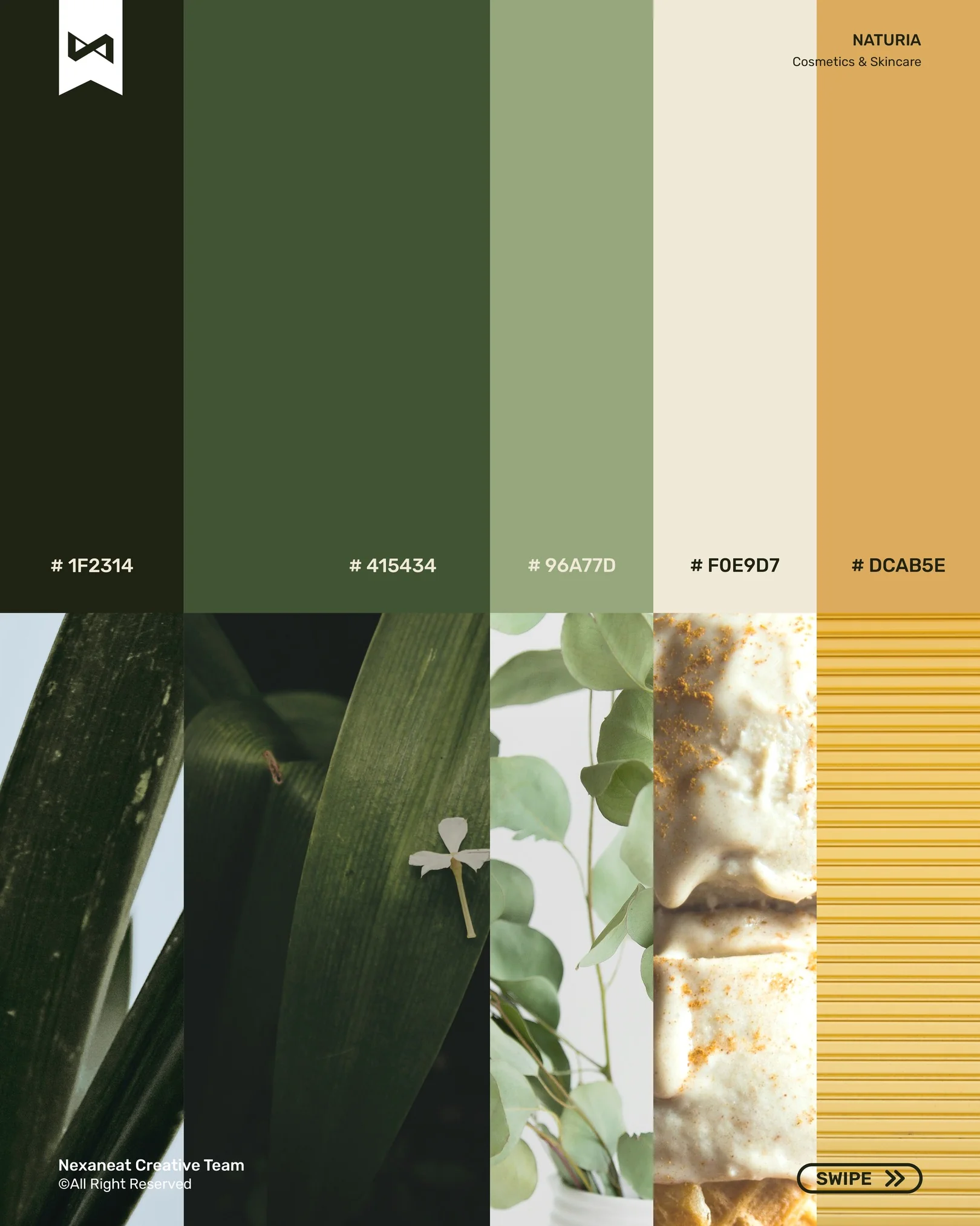
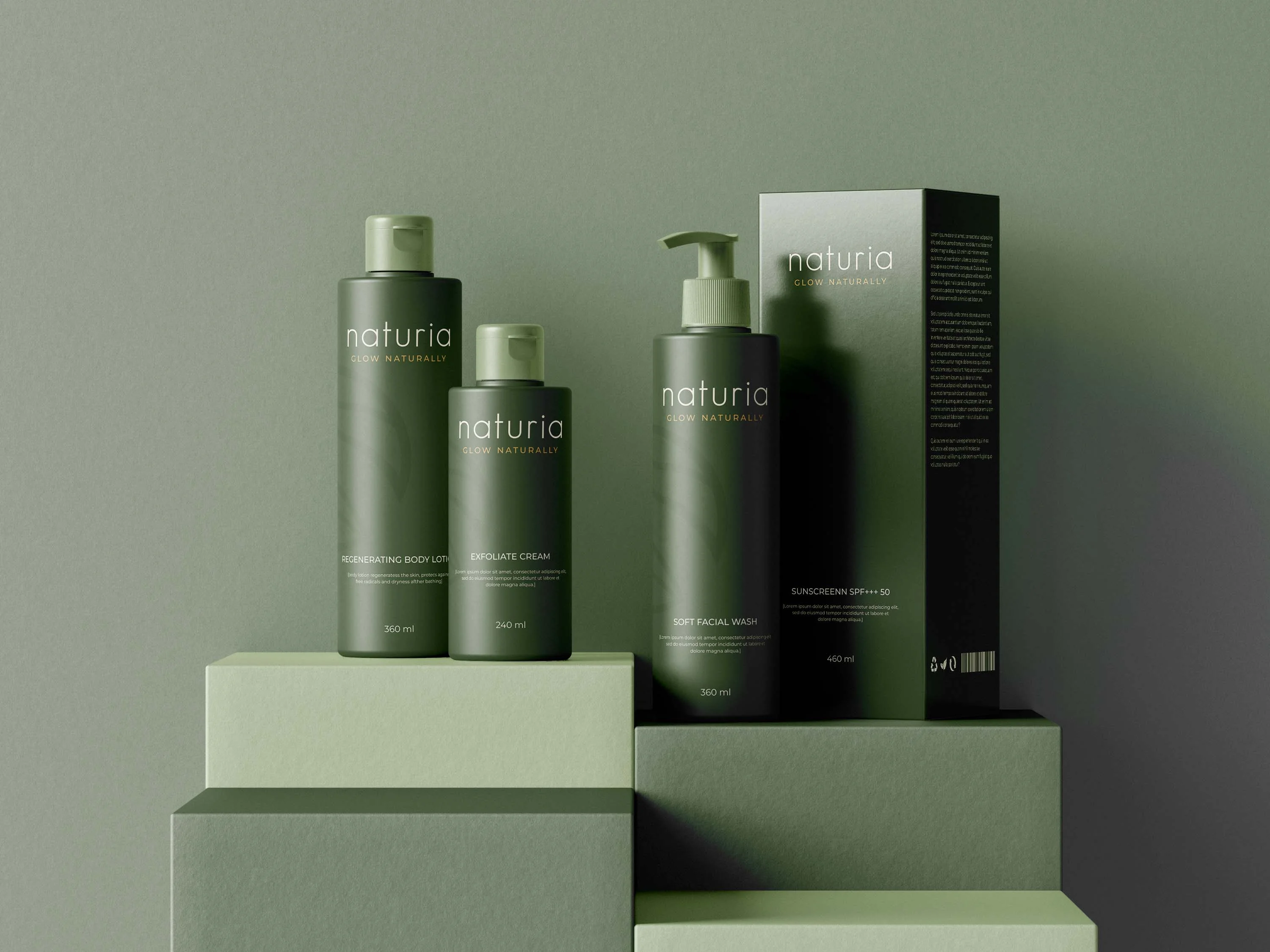
Monochromatic dominance registers as coherence — a brand that is one thing, not five. The green scale stays inside the foliage family so packaging feels like it was lifted out of the leaf. Gold isn't there for luxury; the eye reads warm ochre on green as sunlight hitting a canopy. That colour pairing is the whole promise of the brand — glow, naturally — said without words.
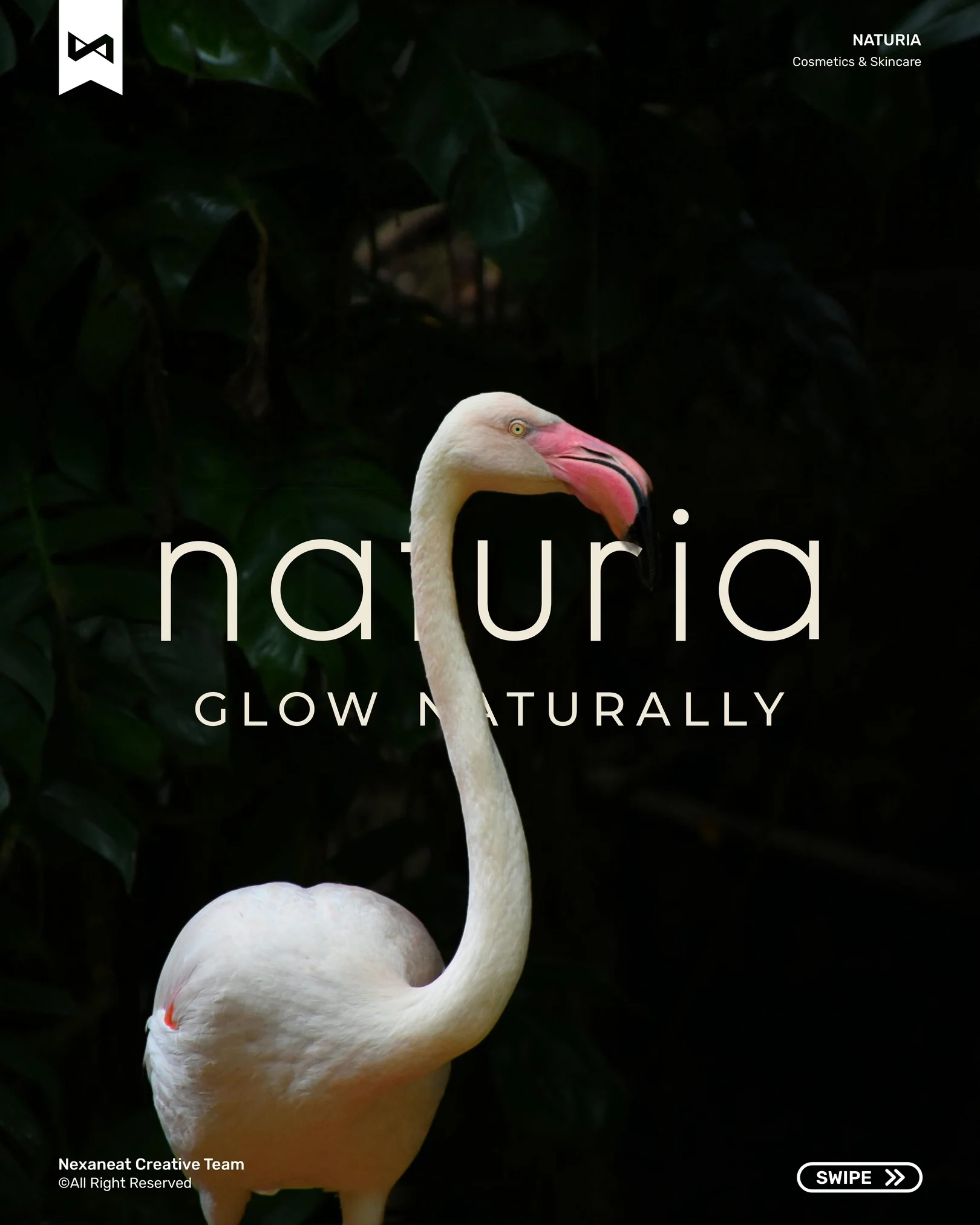
The display face is a rounded humanist sans set in lowercase — biomorphic contours read as made by hand, grown over time. Underneath, the tag GLOW NATURALLY is uppercase, letter-spaced wide, carrying the visual register of scientific packaging. The two together cover the brand's double promise: natural on top, effective below. Hierarchy is enforced by weight and tracking, not by size — so the lockup scales from a 12 ml jar to a six-metre billboard without losing its voice.
Every week closed with a single decision. No drift, no redesign spirals.
Shelf audit in two Jakarta beauty halls plus a founder workshop. We mapped what "natural" actually looks like on-shelf (a lot of beige) and where the negative space was — deep, saturated foliage.
Three routes tested with five target users: botanical-apothecary, tropical-editorial, and clinical-minimal. Tropical-editorial won on recall and emotional warmth by a wide margin.
Mark construction, palette lock, type pairing, and first packaging dielines. We built the logo on a circle grid so every variation — leaf-only, wordmark, badge — stays geometrically related.
Brand guidelines, packaging mechanicals for the full SKU range, a launch social carousel, and a single-frame OOH key visual. Hand-off in one working day.
The launch piece is an Instagram carousel — ten frames that walk a cold viewer from cover to mark to colour to product, in the same order a pitch deck would. Each slide carries the corner bug and the swipe cue so the sequence reads as one connected object, not ten isolated posts.
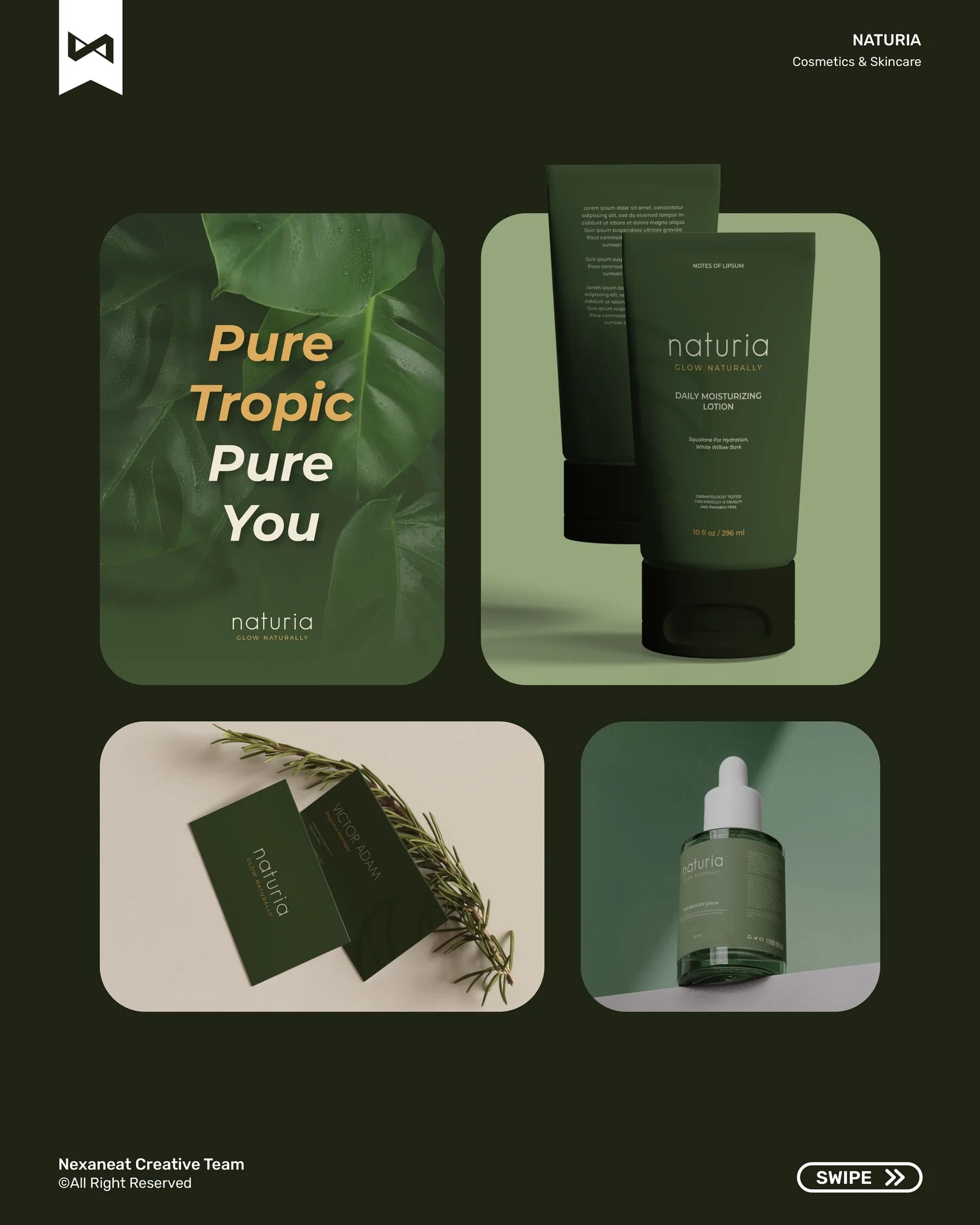
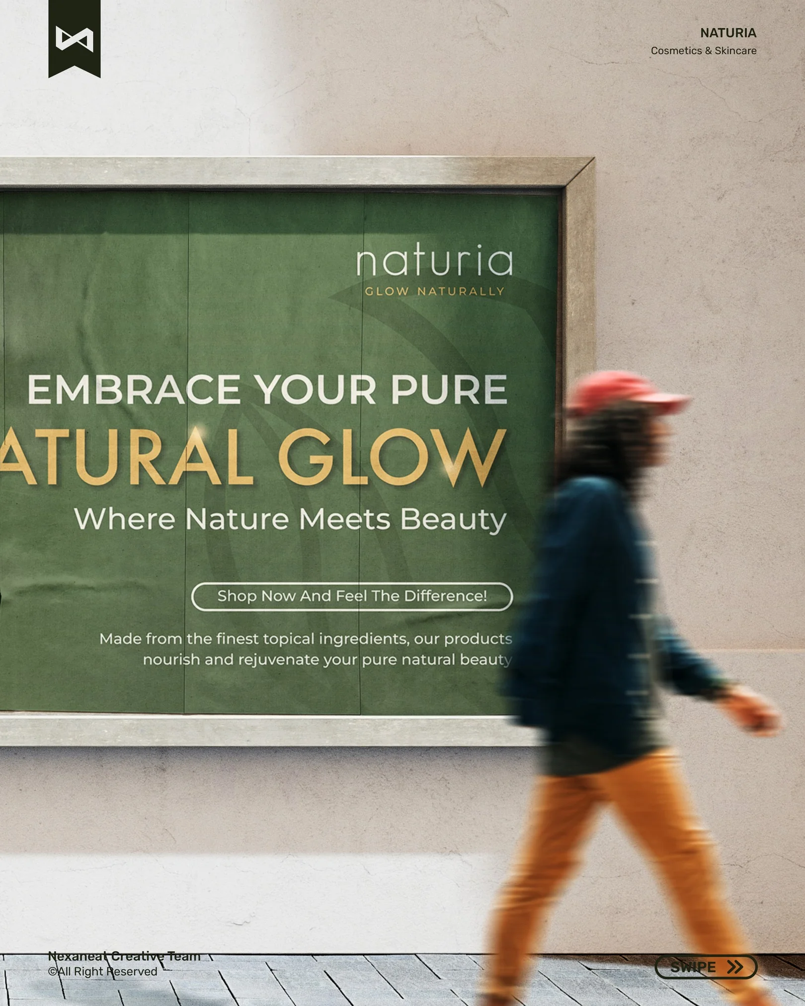
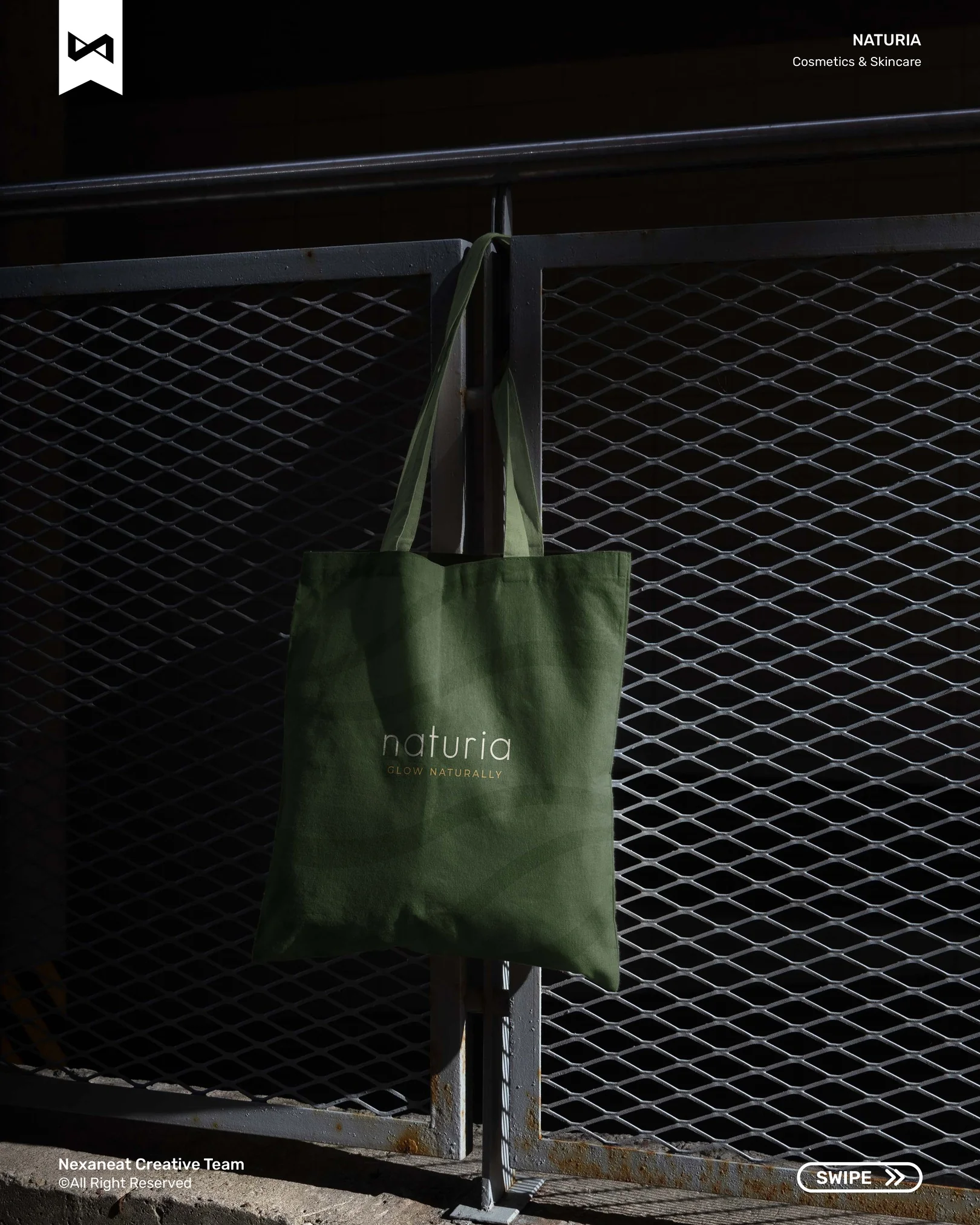
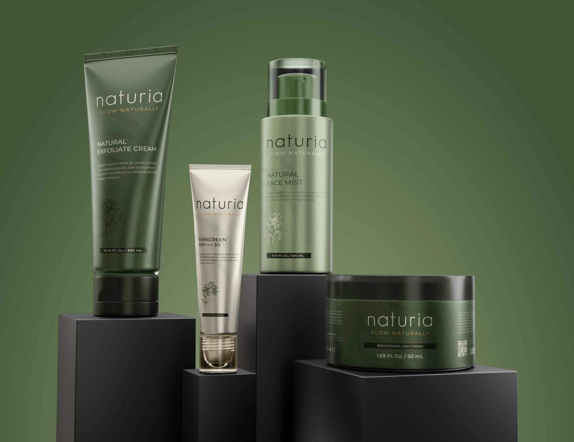
The same four-green-plus-gold system runs across SKUs, stationery and outdoor. Shot sequence below moves from small (a single bottle) to large (the billboard) — the point being that the mark is comfortable at both ends.
 Range on shelf
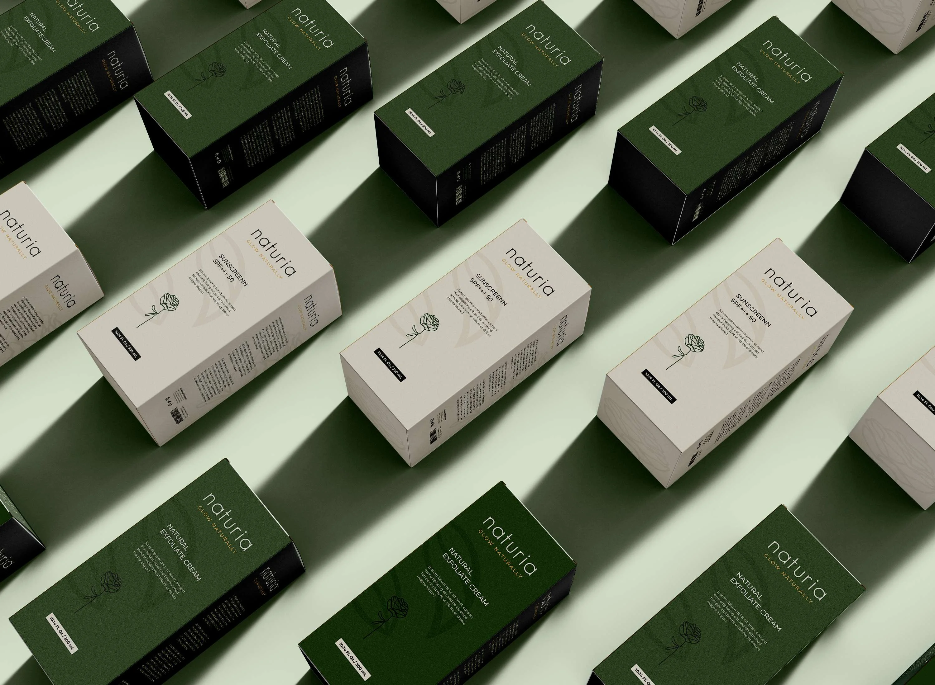 Packaging system
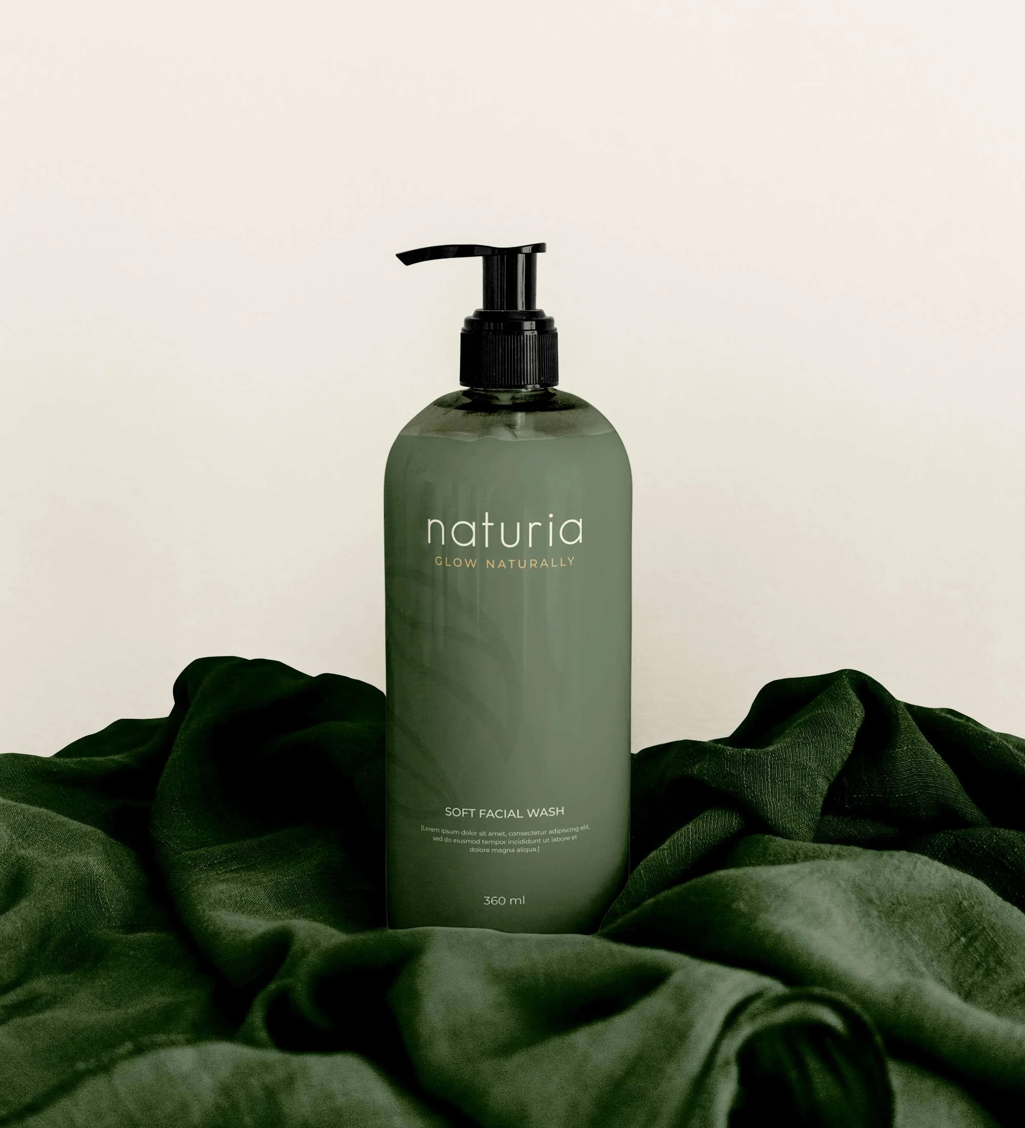 Soft facial wash
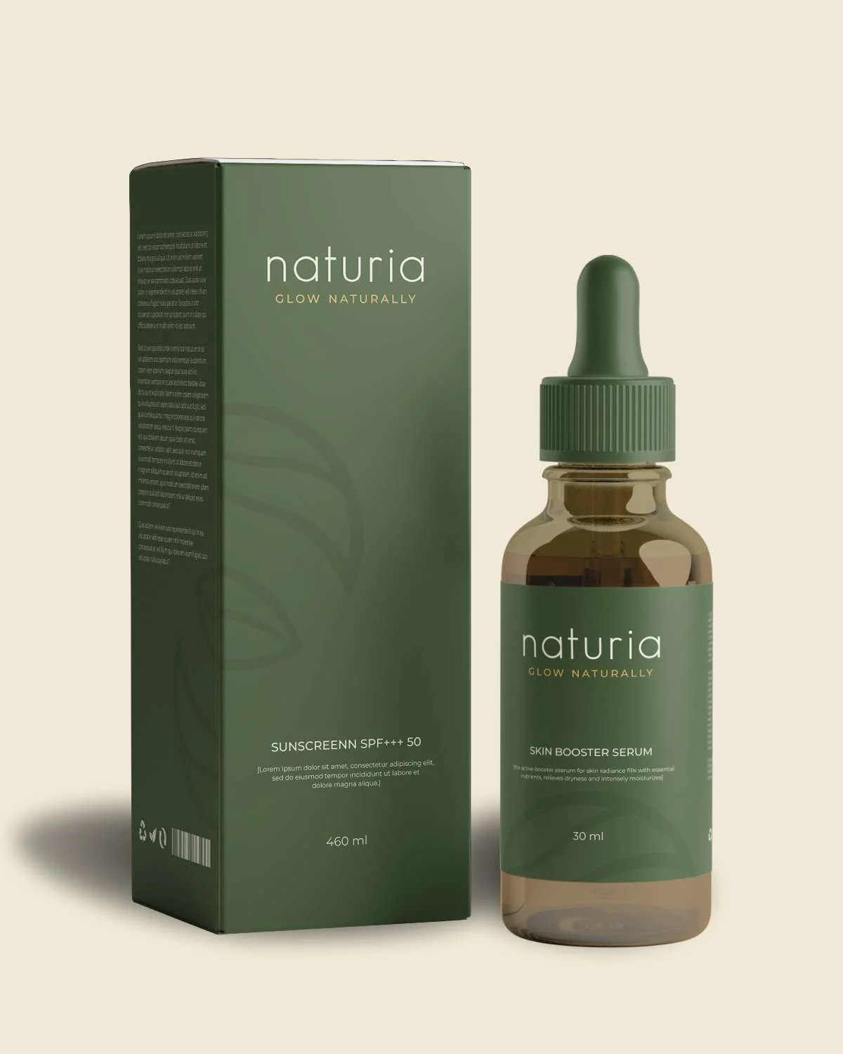 SPF + serum pairing
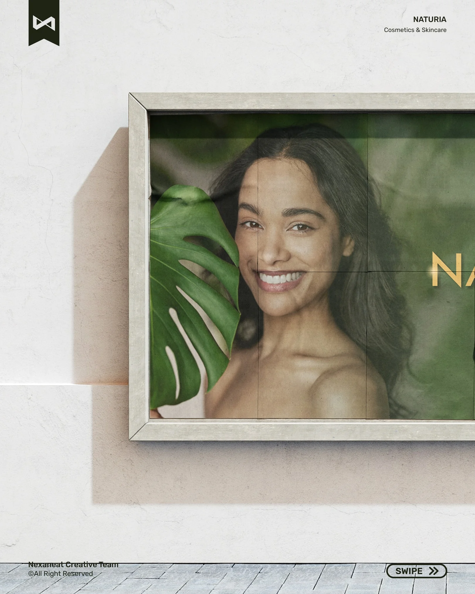
 OOH — launch billboard
Send a sentence about what you're building. Scope and timeline back in 48 hours.